

Enhancing UX and UI of Collegedunia’s College Landing Pages.
Project Overview
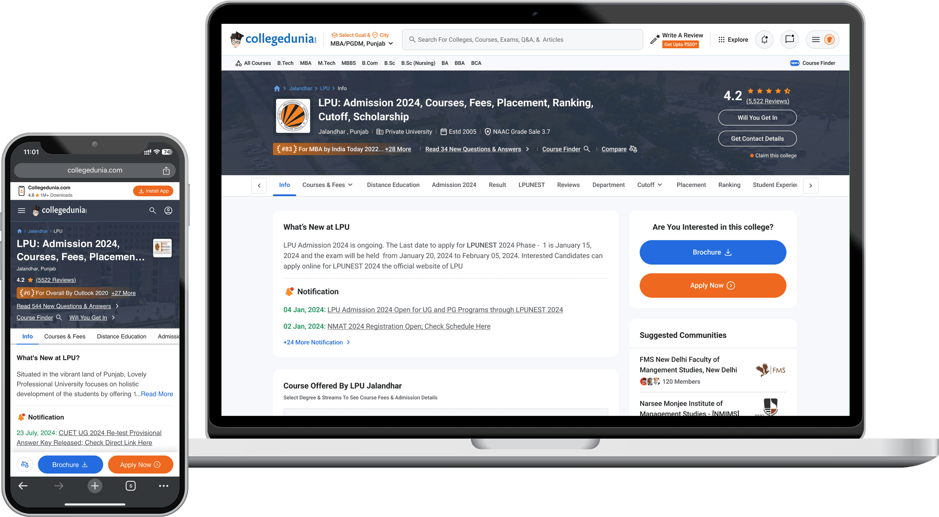
The goal of this project is to make the Collegedunia college landing page more user-friendly, accessible, and enjoyable to use. I’ll start by gathering insights from users and applying the best practices in UX/UI design and accessibility standards. Our aim is to create a platform that feels intuitive and engaging for everyone. This means simplifying navigation, organising content logically, and ensuring the page meets accessibility guidelines so all users can easily access it. I'll develop a consistent, visually appealing design that looks great on any device, and I'll make sure the content is clear and enriched with multimedia elements like images and videos. Through usability testing and performance optimisations, I'll refine the design to provide a smooth user experience. Additionally, I'll introduce personalised content recommendations and interactive elements to boost engagement. Ultimately, I want users to be more satisfied, engaged, and likely to take action, while also enhancing Collegedunia's brand reputation. These enhancements will help us meet the diverse needs of Collegedunia's user base.
Team Strength
(5 Members)

Nikunj Chaurasiya
Sr.UX/UI Designer

Nishit kumar
Head of Product

Harsh Lariya
Product Manager

Prabal Gupta
Product Manager

Sohail Ansari
Product Manager
My Role
In this project, I’ll lead the redesign of Collegedunia’s college landing page to make it more user-friendly and engaging. My role includes gathering user insights through research and testing, and applying UX/UI a best practices to create a visually appealing and intuitive experience. I’ll collaborate closely with developers and stakeholders to ensure the design is both practical and aligned with our objectives.
I’ll also oversee usability testing to refine the design based on real user feedback, with a focus on optimising performance for a seamless experience. By incorporating personalised content and interactive elements, my goal is to increase user engagement and satisfaction—ultimately strengthening Collegedunia’s brand presence.
The Scope of Work
Research
Problem Statement
Competitors Analysis
Heuristic evaluation
Heatmap Analysis
NPS Feedback
Ideation
Information Architecture
Papers Wireframe
Whiteboard sketching
High-Fidelity wireframes
Prototyping
Interactive Prototype
Initial Usability Testing
Iteration Cycle
Design Delivery
Visual Conception
Style Guide
Icons & Illustrations
Final Design for All Layouts
Accessibility Testing
User Testing
Final Usability Testing
Result Summary
Iteration

Research
Competitors Analysis
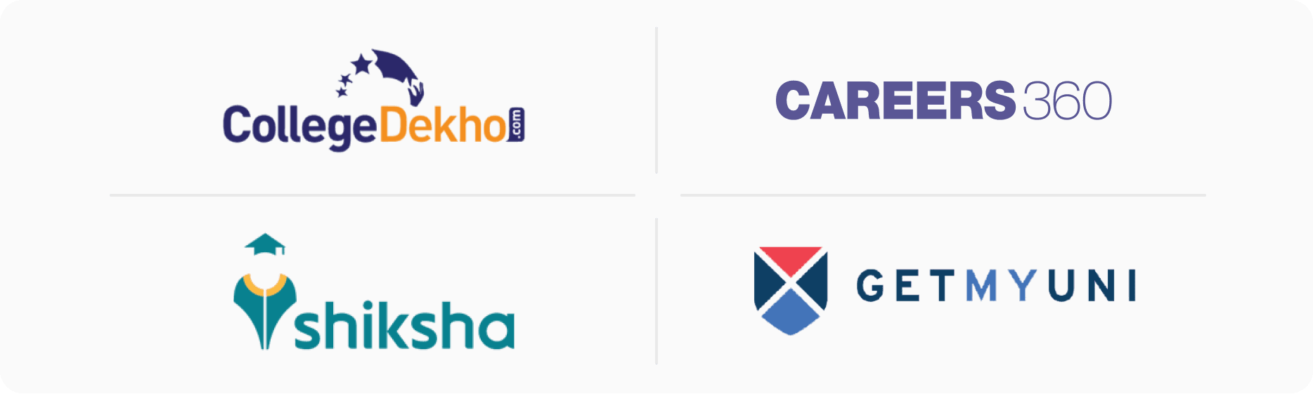
I chose four competitor websites frequently used by students for college searches: CollegeDekho, Careers360, Shiksha, and GetMyUni. I then analysed these platforms by comparing their features, user flow, task flow, interactions, accessibility, visual design, and brand identity. I noted down the features that enhance the user experience on their websites. Below, I’ve showcased the key features and analysis for each.
Shiksha
Collegedekho
Careers 360
GetMyUni
Easy of Use
Easy
Easy
Easy
Easy
Information Delivery
Easy
Average
Average
Easy
Navigation
Easy
Average
Easy
Easy
Accessibility
Average
Easy
Average
Average
User Interface
Easy
Easy
Average
Easy
Login & Registration
Easy
Easy
Easy
Easy
Features available on the college landing pages
College Compare
Available
Available
No Global Compare CTA
Available
Available
Stories
Available
Video Format, Similar to Insta
Not Available
Available
In Form of written content
Not Available
Videos
Available
Available
Available
Not Available
Course Compare
Available
Available
Available
Not Available
Placement Insights
Available
Not Available
Available
Available
College Recommendation
Available
Not Available
Available
Representing in Popular Univeritiy
Available
Heuristic Evaluation
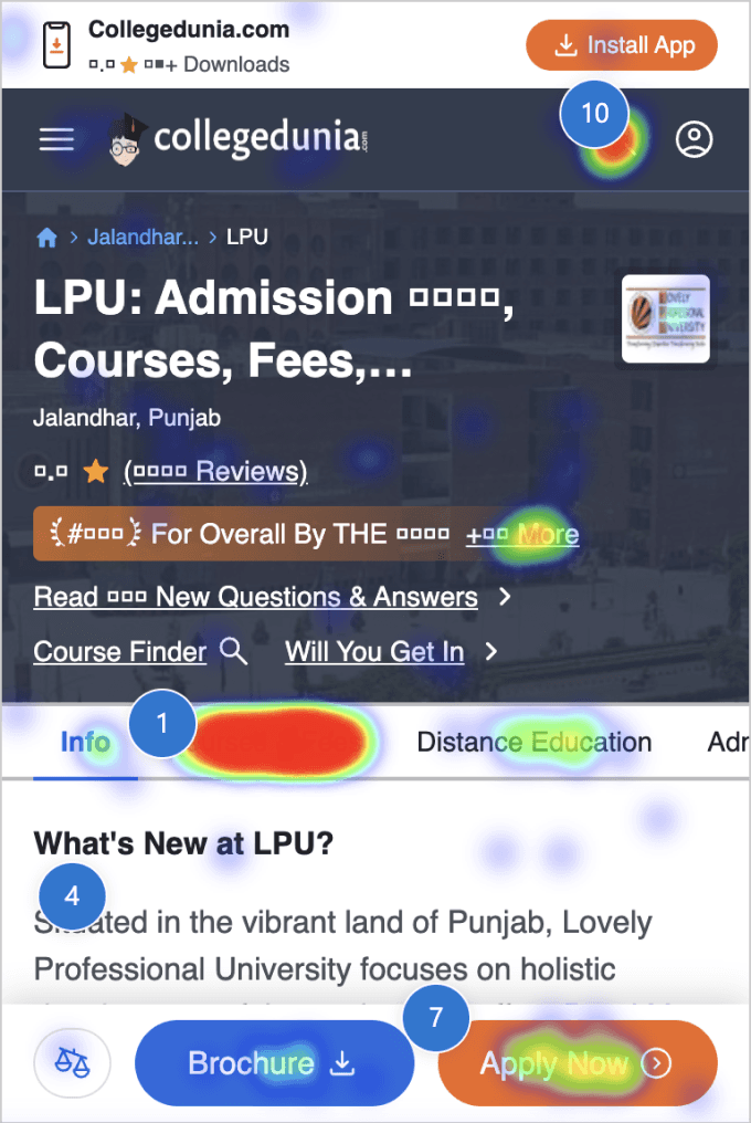
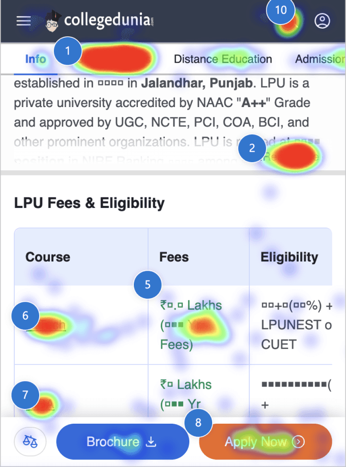
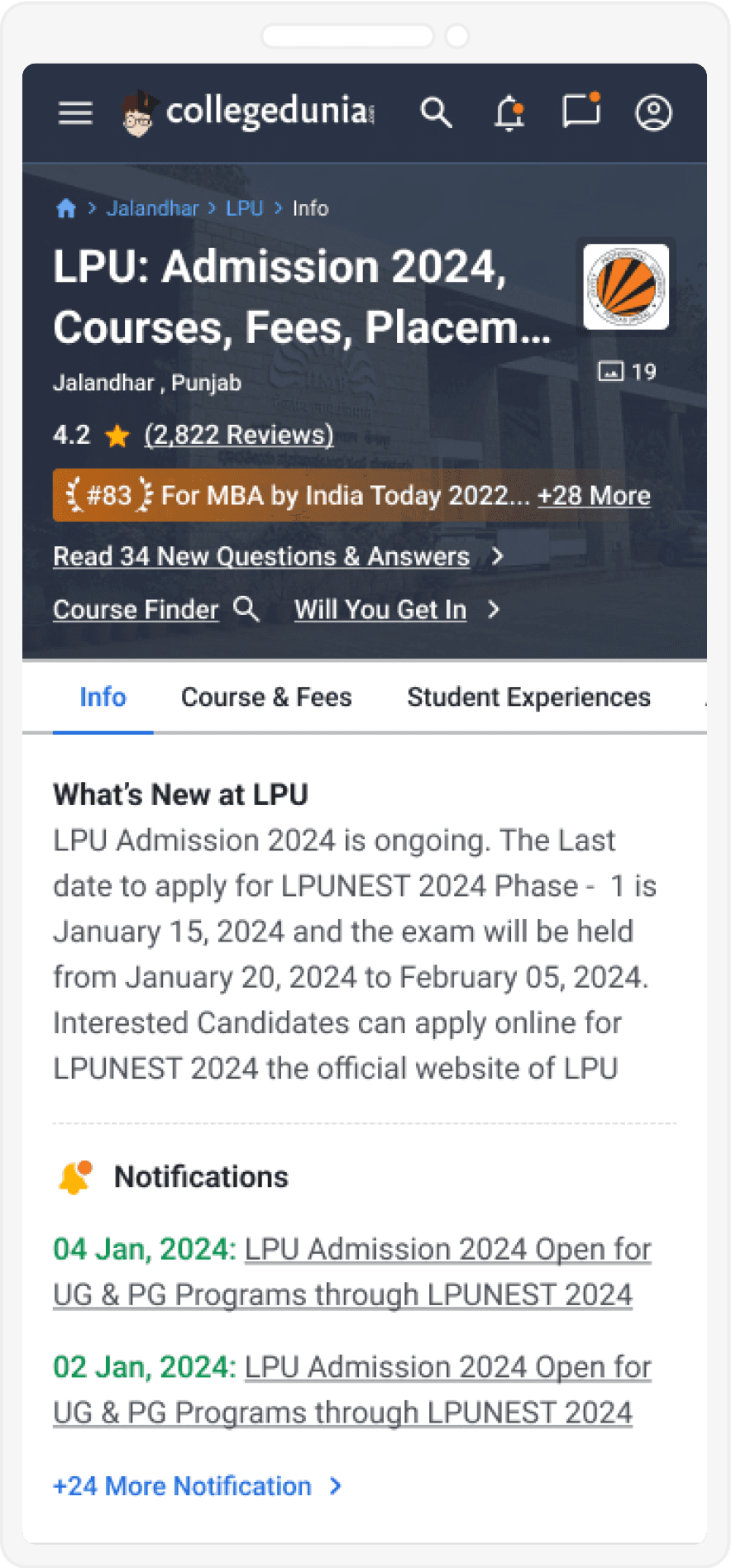
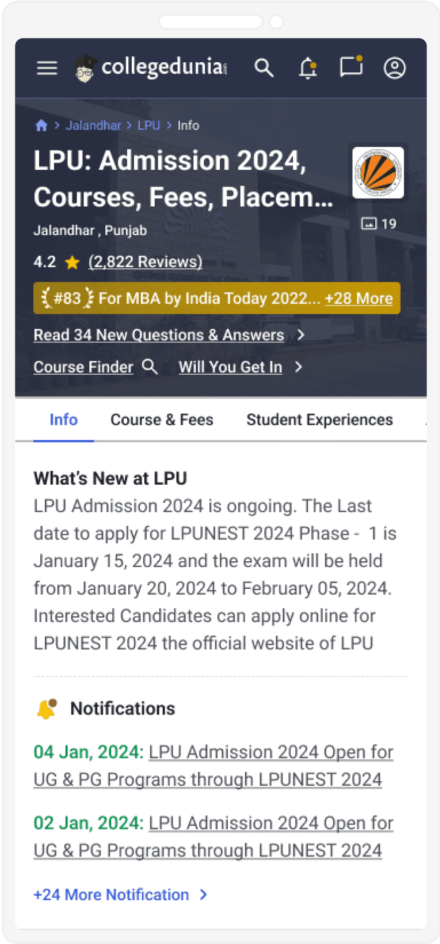
I conducted a heuristic evaluation to dive deeper and understand the usability issues on Collegedunia’s college page across both desktop and mobile web. I identified several problems that violated key heuristics in the previous design. Below, I’ve showcased a few glimpses of the heuristic issues found.
Match Between System & the Real World
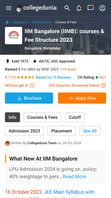
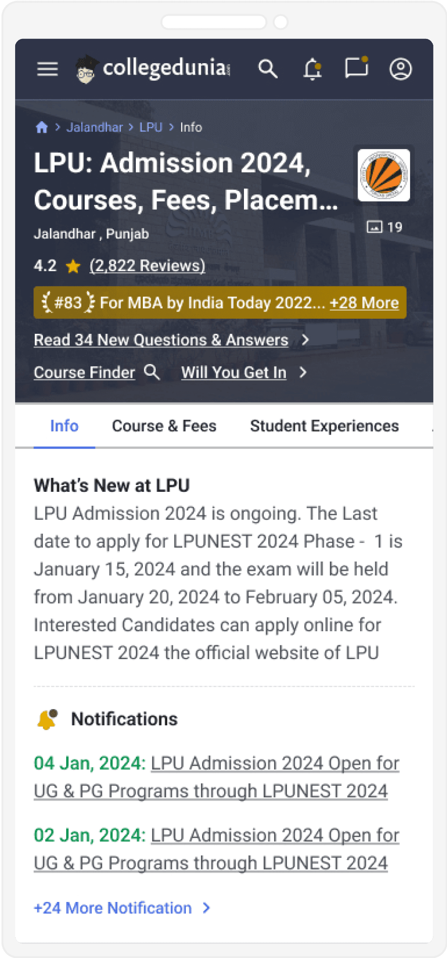
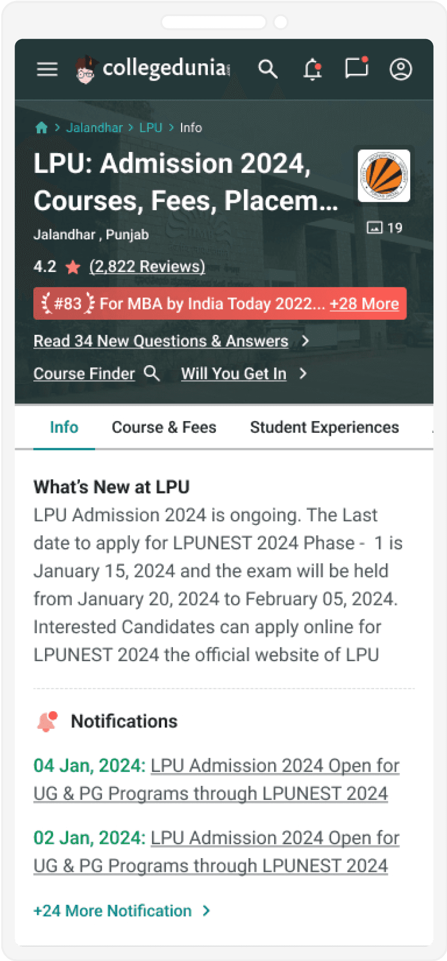
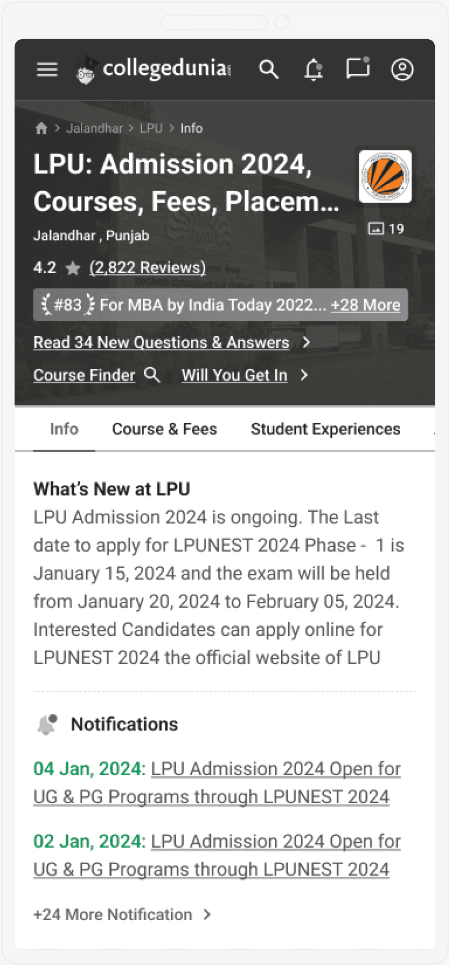
Using dots instead of stars for ratings confuses users, as it breaks common visual expectations. The review link also lacks clear styling, making it hard to identify as clickable. Familiar patterns like star ratings and blue links would improve clarity and usability.

In the notification section of the college landing page, the date is shown in red. However, red is typically associated with alerts or warnings. Since users often scan content before reading in detail, this color choice can cause confusion or unnecessary concern. It doesn’t align with the user's mental model or real-world color conventions.
Aesthetic and Minimalist Design
The first view of Collegedunia’s college landing homepage appears cluttered, with inconsistent alignment and improper spacing throughout the old design. These visual issues disrupt the layout and reduce clarity, making the overall experience feel overwhelming and unpolished. A cleaner, more organised interface with proper spacing and alignment would greatly enhance visual consistency and usability.
NPS Feedback
Below, I showcase just a sample of the NPS (Net Promoter Score) feedback. There are thousands of NPS responses collected through the website's NPS functionality.
Poor presentation and depressing design for the website. Data not oriented properly
The college review section needs to be more organised and user-friendly
The website needs better search functionality and accurate results
Improve the website's load time and provide better data accuracy
Improve the website design and make it more user-friendly
The site is too complicated. It needs a simpler design
Some color of the website which is not good for us
The website is good but can be improved with a cleaner design and faster load time
Not so Good And User Friendly not for beginner. also give direct links
Improve the website quality User can not want to switch multiple pages
Improve the overall design to be more intuitive and engaging
The website design needs to be more consistent and visually appealing
I couldn't understand easily score conversion table. If it was separated by skills, it would be more understandable."
The text is easy to follow and it has necessary bullet points and words in bolt. would be nice to make he deadline date bigger and in red.
Too much going on, Hard to navigate,
Needs to improve the content quality more
Some efforts are required to make the webpage more interactive
Not a good experience of the very first visit.
The website is bad. it’s design and user interface needs to be improved.
Dull design of the website and not like the colour
Navigation is confusing, Visual Elements are Cultured
Some colour of the website which is not good for us
It's quite difficult to find exam tasks and answers here.
Text size too small for comfortable reading.
Organizing Feedback into Clusters and Extracting Key Themes
Design Issues
Navigation is confusing.
Visual elements are cluttered.
Color scheme is not appealing.
Overuse of bright or clashing colors.
Inconsistent or inadequate spacing between elements.
Misaligned text or components.
Readability Issues
Text is too small.
Fonts are not legible.
Content is not structured well.
Text lines that are too long or too short.
Accessibility Issues
No alt text for images
Insufficient color contrast
No keyboard navigation support
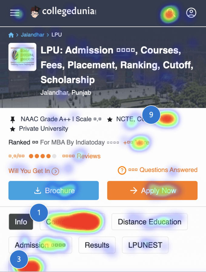
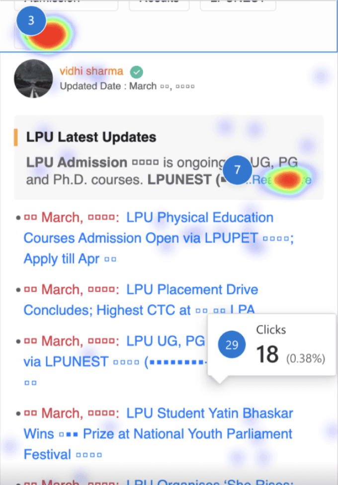
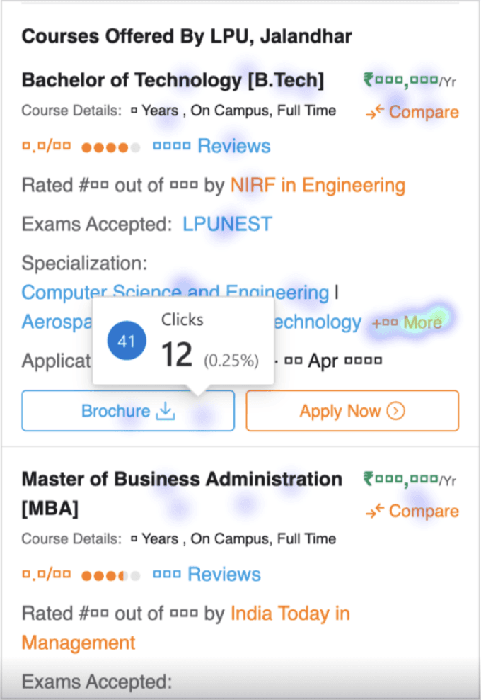
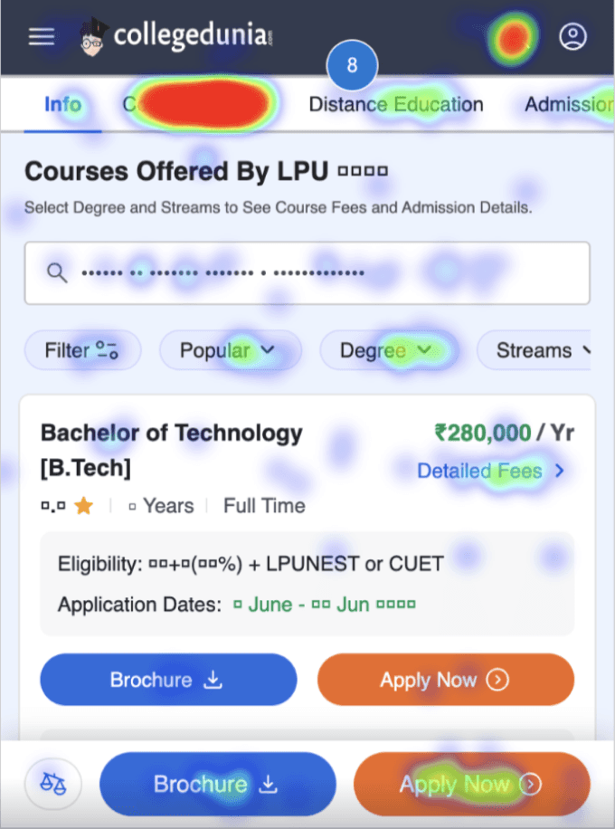
Heatmap Analysis
Users Behaviour Analysis Through Heat-maps
Below, I present a glimpse of the heatmaps, reflecting user behaviour on both the old and new screens. These maps illustrate where users are attempting to tap, engaging with CTAs or links, and trying to scroll through the website. A comparison of the heatmaps clearly shows that users are more engaged on the new screen, with deeper colour intensity highlighting areas of higher interaction. For heatmap and screen recording tracking, I used Microsoft Clarity.
Heatmap Analysis of the Old Design
Heatmap Analysis of the New Design
Ideation
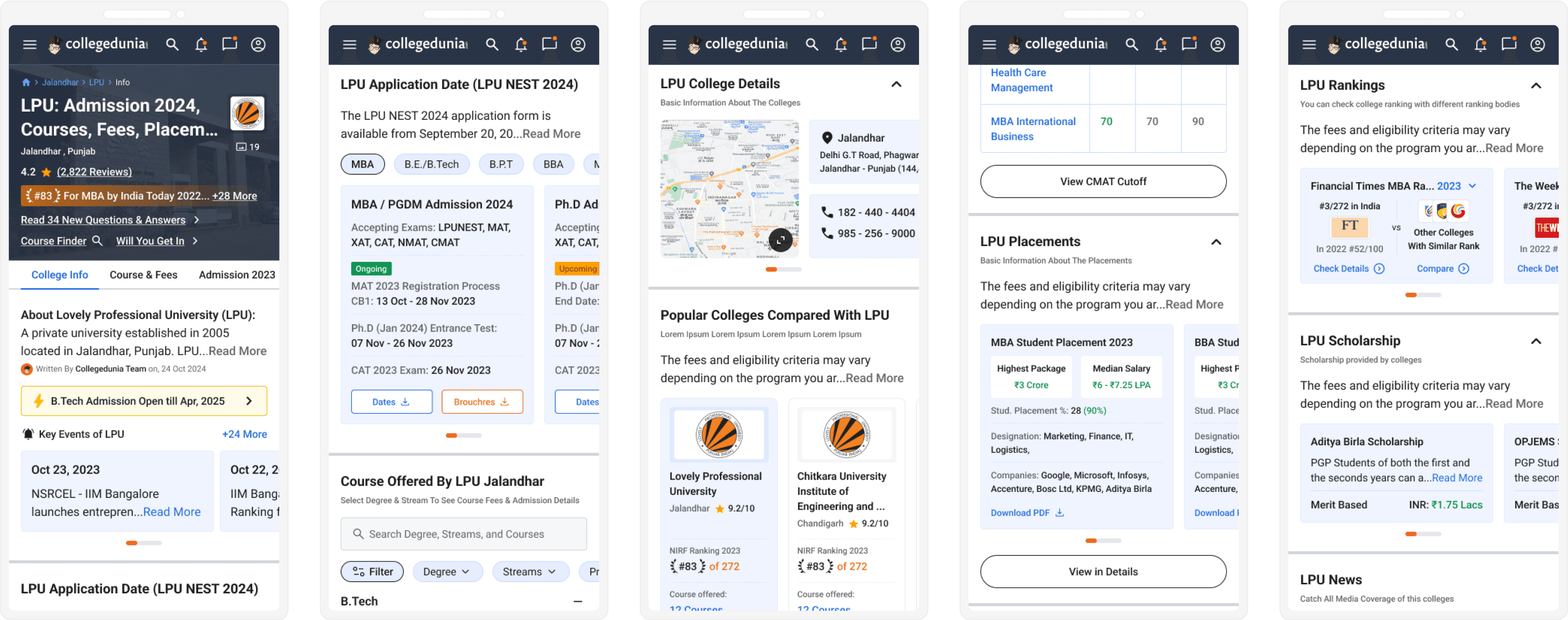
Initial Design Exploration and SEO-Driven Refinements
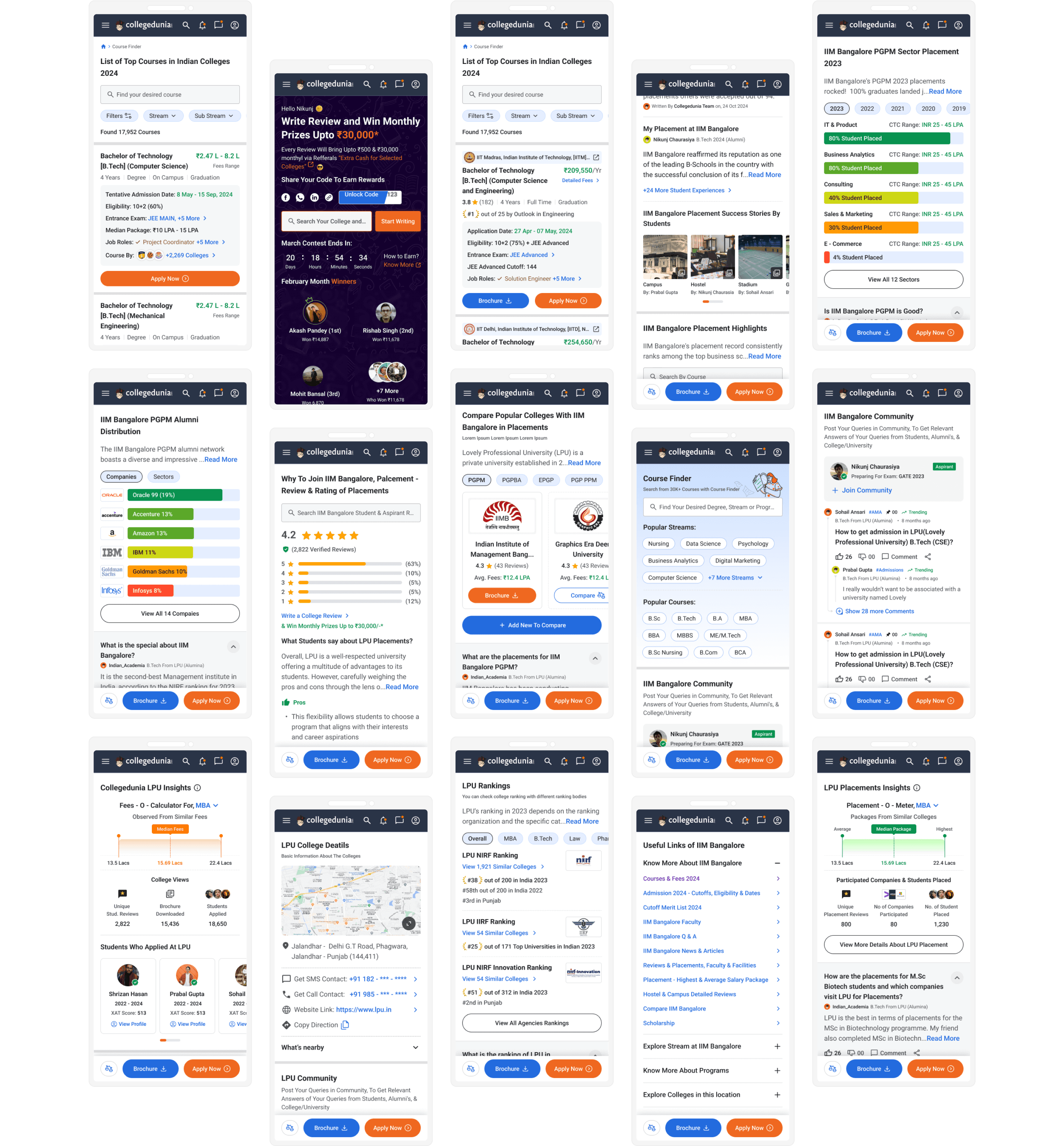
Initially, I designed two versions of Collegedunia's college landing page: the first version without any iterations, and the second, refined based on user feedback, stakeholder input, and iterative improvements. Below, I’ve showcased some glimpses through images.
In Version 1, most sections were designed in a card view format, allowing users to scroll horizontally to view details based on their preferences or goals. However, since Collegedunia is a highly SEO-driven company, content rendered through JavaScript could affect search engine visibility. As a result, these screens were ultimately not developed.
Accessibility
Colour Blindness Check
People with colour vision impairment can't see certain colours, which means that I can't rely solely on colour coding in my designs. I used multiple online tools to check if the designs were compatible with colour-blind users.
Normal Screen
Deuteranopia
Protanopia
Tritanopia
Achromatopsia
Visual Designs
100+ Screens

To Know More, Connect with me on LinkedIn

Thank you for scrolling down!
I appreciate your likes and comments—they make me happy!